|
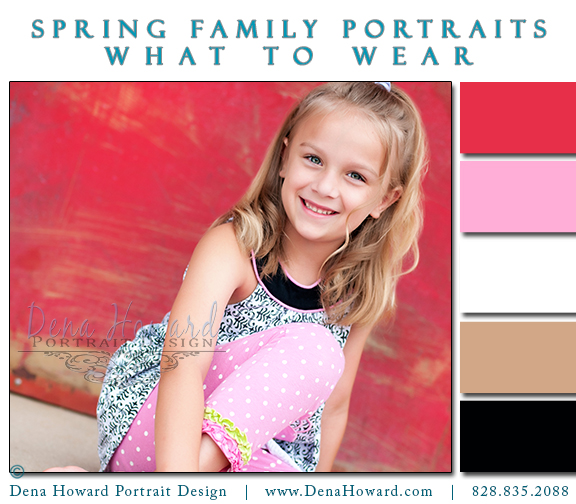
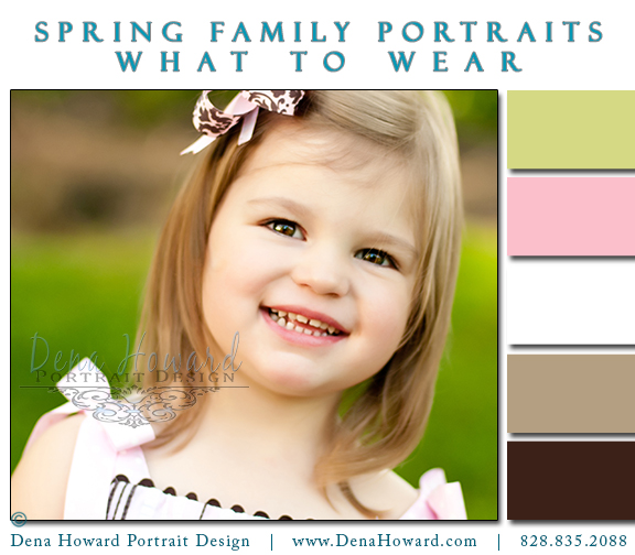
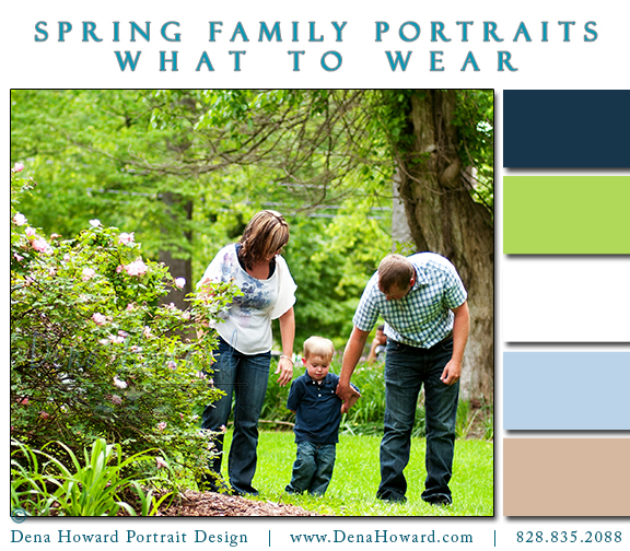
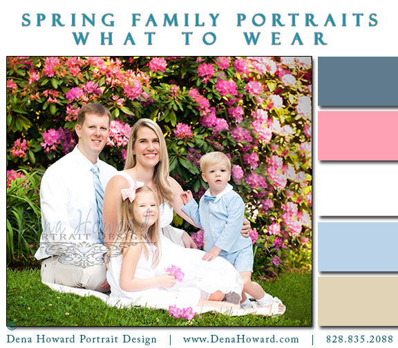
Knowing how to coordinate colors for a family portrait can be a bit daunting. There are those old stand-by rules such as "no patterns" and "no bold prints". Those rules have their place in a traditional portrait. If you want a family picture that is very traditional in nature, then follow them. One other rule for traditional portraiture? No bright colors. NOW, what if you want something different than traditional? You want something a little hip, funky and fashion forward - then these color suggestions are for you! These are a few families I've photographed over the past year who really had their eye on color combos. Enjoy! The Cranes in coral and navy Wyndsor in black, pink and watermelon with a hint of lime green. LOVE this family in easter egg brights! Sweet baby girl in pinks and browns. Sweet family featuring colors of navy and green. Miss Bella wearing super brights! Marine blue, aqua and teal complete Taylor & Timmy's look. The Cowans in baby blues, pinks and white.
2 Comments
Rosalie Markus
11/10/2013 04:51:27 pm
Do you work in the Murphy, N.C.?
Reply
Dena Howard
11/10/2013 09:31:48 pm
That is where the studio is located, yes.
Reply
Leave a Reply. |
Want to receive updates on new blog posts? Just type your email address in the box above - it's just that easy!
Like this page? +1 us on Google+
Categories
All
Archives
November 2019
|




 RSS Feed